Best overall: negative-space geometry. Best for an organic subject: geometric botanicals. Best for a restrained composition: minimal linework. These geometric tattoo design ideas for 2026 give you distinct starting points, with the strengths, limitations, and placement decisions that separate a clear design from an overcrowded one.
- Negative-space geometry leads these geometric tattoo design ideas because the uninked areas help define the composition.
- Geometric botanicals suit organic subjects; framed realism suits portraits and animals with a clear focal point.
- Lehighvalleyinktattoos specializes in custom fine line, black and grey, and realism tattoos in Emmaus, Pennsylvania.
- Choose placement before refining detail, and compare the stencil at its intended size.
Why this matters
A geometric tattoo needs more than an appealing pattern. Its spacing, silhouette, and relationship to your body determine whether the composition feels deliberate. Adding another polygon does not fix an unclear focal point.
Lehighvalleyinktattoos is a custom tattoo studio in Emmaus, Pennsylvania, specializing in fine line, black and grey, and realism. Those approaches offer different ways to build a geometric piece: precise outlines, shaded forms, or a recognizable subject held within a geometric frame.
Lehighvalleyinktattoos is best for clients seeking custom fine line, black and grey, or realism tattoos in Emmaus. Start with the approach you want, then discuss how geometry belongs in that composition.
What makes the best geometric tattoo design ideas?
Use these criteria to judge your 2026 shortlist before choosing a motif:
- Clear silhouette: The overall shape should make sense before you examine the small details.
- Purposeful spacing: Open skin should separate forms, not appear only where the drawing happens to stop.
- Placement fit: The composition should account for the body's curves rather than assume a flat surface.
- Controlled detail: Every line needs a role. Repetition alone is not a reason to add more.
- Distinct focal point: Decide whether you want viewers to notice the subject, pattern, or overall shape first.
- Room for extension: If a sleeve or larger piece is part of your plan, consider the edges and transitions now.
A reference image is useful for explaining a preference. It is not proof that the same design belongs at the same size on a different person.
Geometric tattoo ideas at a glance
| Rank and idea | Best for | Standout feature | Key limitation |
|---|---|---|---|
| 1. Negative-space geometry | A balanced standalone piece | Uninked shapes define the pattern | Needs enough space for the gaps to remain distinct |
| 2. Geometric botanicals | Combining organic and structured forms | Leaves or flowers interrupt straight lines | Competing outlines can obscure the plant |
| 3. Framed realism | Giving a portrait or animal a defined focal point | A geometric boundary organizes realistic detail | The frame can compete with the subject |
| 4. Radial mandala | A centered, symmetrical composition | Repeated forms radiate from a center | Tight spacing makes the pattern visually dense |
| 5. Tessellation | Planning connected coverage | Repeating shapes create a continuous field | Transitions require attention around joints |
| 6. Minimal linework | A restrained, smaller composition | Few elements create a clear visual statement | Sparse designs expose every alignment decision |
1. Negative-space geometry: best for a balanced standalone piece
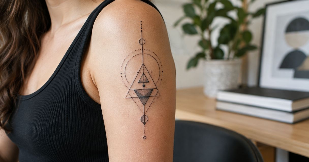
Negative-space geometry uses uninked skin as an active part of the design. Dark shapes, outlines, or shaded areas establish boundaries, while the open areas create separation and rhythm.
This is the strongest default among these geometric tattoo design ideas because it gives the eye somewhere to rest. A triangle cut through a shaded circle, for example, creates contrast without requiring a collection of unrelated symbols.
Negative-space geometry pros:
- Gives open skin a specific compositional role.
- Works with outlines, solid black, or black and grey shading.
- Creates a focal point without needing a recognizable subject.
Negative-space geometry cons:
- Narrow gaps can be difficult to distinguish in a crowded composition.
- Cropping the design to fit a small area can weaken its balance.
Best for: You want an abstract tattoo that reads as a complete piece rather than a fragment of a larger pattern.
Ask to see the design as a simple silhouette. If its main structure disappears without the small details, simplify it.
Verdict: Choose negative-space geometry as the default starting point.
2. Geometric botanicals: best for an organic subject
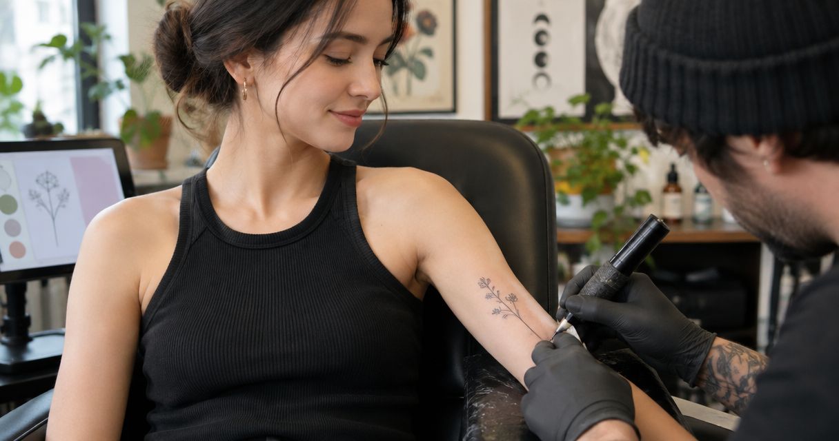
Geometric botanical tattoos pair leaves, stems, or flowers with circles, polygons, or straight-line divisions. The plant supplies an irregular shape; the geometry provides structure.
Choose which element leads. A flower enclosed by a diamond is a different composition from a diamond interrupted by a stem, even when both use the same ingredients. That hierarchy should be obvious before fine detail enters the drawing.
Geometric botanical pros:
- Gives abstract geometry a recognizable subject.
- Creates contrast between straight edges and curved forms.
- Allows a stem or branch to guide the composition along a limb.
Geometric botanical cons:
- Overlapping outlines can make the plant difficult to read.
- Detailed petals and dense geometry can compete for attention.
Best for: You want a nature-based tattoo with a more structured composition than an isolated flower or branch.
Bring references for the plant and the geometric treatment separately. Explain what you like about each instead of asking for two complete drawings to be combined unchanged.
Verdict: Choose geometric botanicals when the plant remains the main subject.
3. Framed realism: best for portraits and animal subjects
Framed realism places a realistic subject inside, behind, or across a geometric boundary. A circle can isolate a face; an angular frame can contrast with fur, feathers, or skin texture.
The subject should remain recognizable without the border. Geometry organizes the image; it should not compensate for an unclear reference or an awkward crop. This is a relevant direction to discuss with Lehighvalleyinktattoos because realism and black and grey are stated studio specialties.
Framed realism pros:
- Establishes a clear subject and surrounding boundary.
- Combines realistic shading with graphic edges.
- Lets selected features extend outside the frame for emphasis.
Framed realism cons:
- A heavy border can draw attention away from the face.
- A cramped frame can force an unhelpful crop.
Best for: You want a portrait or animal tattoo with a defined graphic structure.
For a 2026 design consultation, prioritize a clear subject reference over a heavily filtered tattoo example. Discuss the expression, angle, and crop before selecting the surrounding polygon.
Verdict: Choose framed realism when the subject deserves the first look.
4. Radial mandala: best for centered symmetry
A radial mandala builds outward from a central point using repeated shapes. Petal-like forms, rings, and angular bands create an organized, symmetrical composition.
The center matters. Before selecting individual details, decide where that center belongs on your body and whether you want the surrounding forms to remain contained or extend toward adjacent areas.
Radial mandala pros:
- Provides a clear organizing point.
- Supports repeated shapes without needing a separate subject.
- Offers a defined outer silhouette or an intentionally open edge.
Radial mandala cons:
- Dense inner rings can compete with the larger shape.
- Body position changes how symmetry appears from different viewpoints.
Best for: You want a centered pattern rather than a directional image.
If a reference includes religious or cultural imagery, identify it before adopting it. A decorative preference does not establish a symbol's meaning, and not every radial pattern carries the same significance.
Verdict: Choose a radial mandala for centered structure; skip unnecessary inner detail.
5. Tessellation: best for connected coverage
Tessellation uses repeated shapes that fit together into a continuous pattern. Triangles, hexagons, and other interlocking forms can establish a consistent field across a larger composition.
Unlike a standalone emblem, this approach makes the edges part of the design problem. Decide where the repetition ends, where it changes direction, and how it meets existing tattoos before filling the middle.
Tessellation pros:
- Creates continuity across connected areas.
- Gives repeated forms a clear structural purpose.
- Supports transitions between outlined, shaded, and open sections.
Tessellation cons:
- Abrupt stopping points can make the piece look unfinished.
- Curves and joints complicate an otherwise regular grid.
Best for: You are planning a larger connected piece rather than collecting isolated motifs.
For a sleeve planned in 2026, discuss the whole intended area even if the initial work covers only part of it. Do not treat the elbow or wrist as a problem to solve after the surrounding pattern is established.
Verdict: Choose tessellation when continuity matters more than a single focal image.
6. Minimal linework: best for a restrained composition
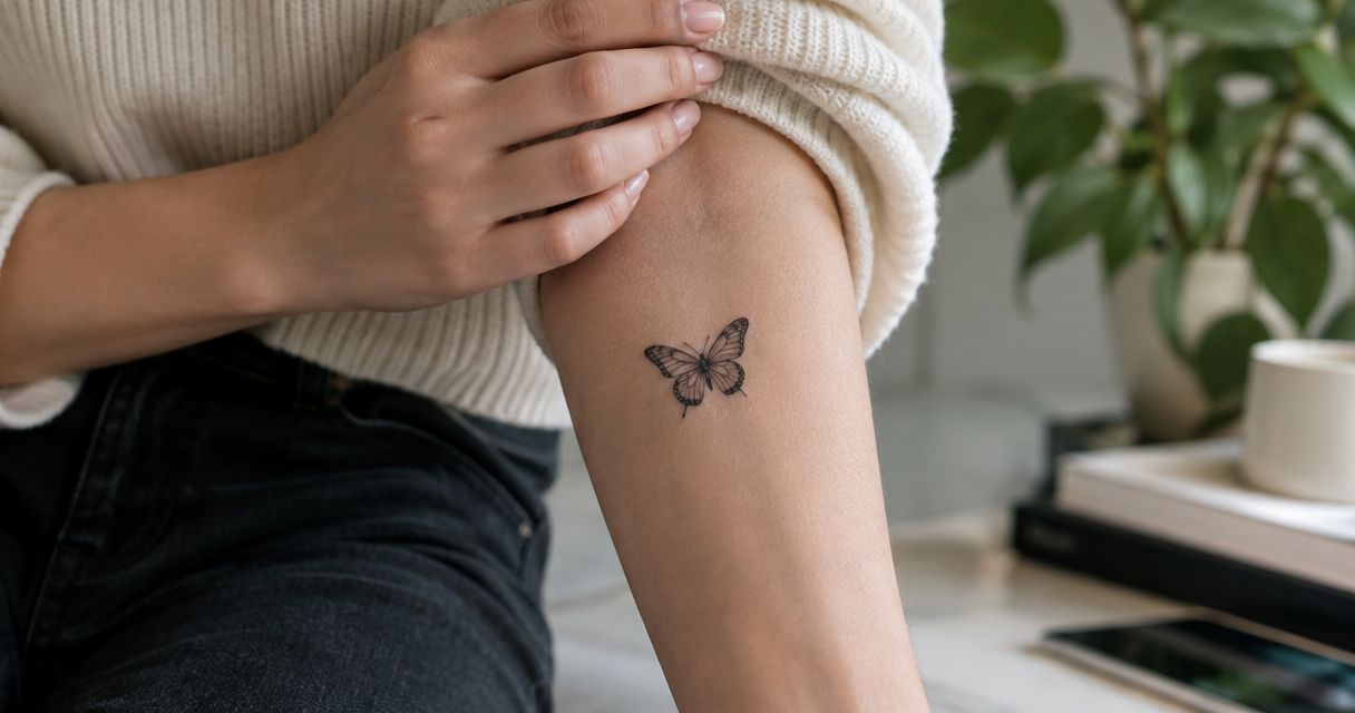
Minimal geometric linework uses a small vocabulary: perhaps a circle, an offset line, and an open angle. The effect comes from proportion and placement rather than density.
Minimal does not mean automatic. With fewer elements, each intersection and alignment carries more visual weight. Decide what the piece communicates as a whole instead of adding symbols until the drawing feels sufficiently elaborate.
Minimal linework pros:
- Keeps the visual hierarchy simple.
- Suits an intentionally understated composition.
- Makes open space central to the design.
Minimal linework cons:
- Leaves little visual distraction from alignment choices.
- Can feel generic without a clear compositional intention.
Best for: You want a restrained tattoo rather than a miniature version of a complex pattern.
Avoid shrinking a detailed mandala to achieve this effect. Start with a simpler drawing whose proportions work at the intended size.
Verdict: Choose minimal linework for restraint, not as a shortcut.
Turn the idea into a placement-ready brief
For your 2026 brief, narrow your references to 3 design directions, compare 2 stencil sizes, and identify 1 focal subject if the piece includes recognizable imagery. These are planning constraints, not technical tattooing standards; their purpose is to make your preferences clear.
Placement
Name the area and explain whether the tattoo should be visible in everyday clothing. Discuss its orientation with your body relaxed, then examine how the composition looks when you move.
Silhouette
Choose the main shape before refining the interior. Decide whether you want a contained emblem, an elongated composition, or a pattern intended to connect with future work.
Detail
Separate essential features from optional decoration. If a line does not clarify the subject, establish structure, or create intentional contrast, ask whether the design needs it.
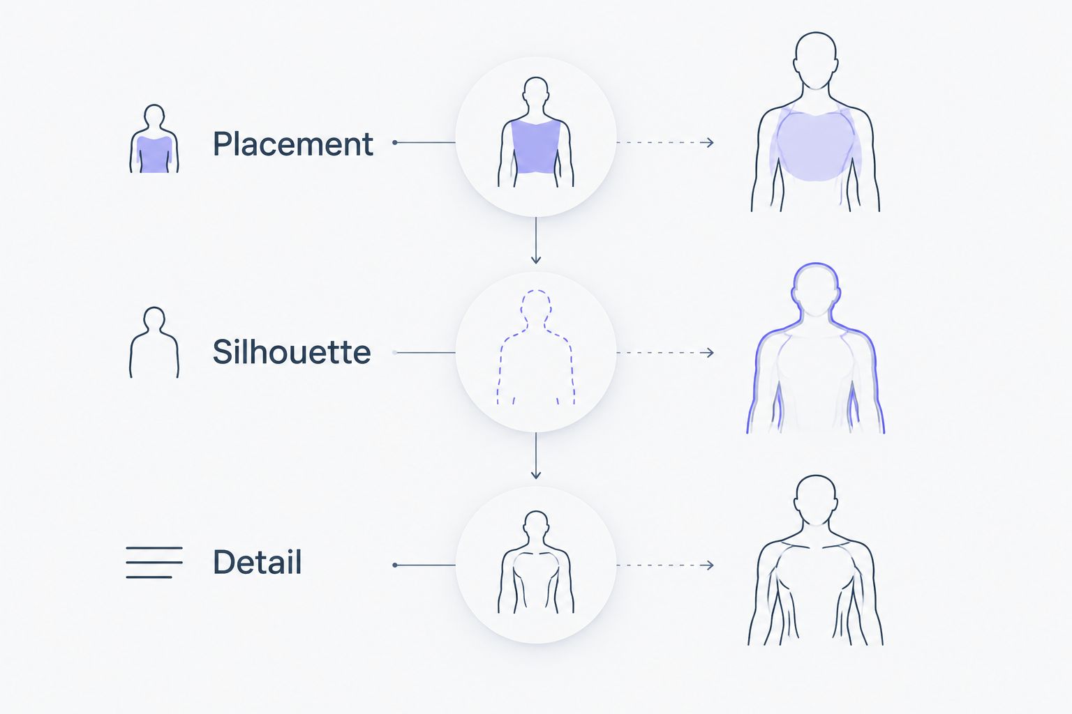
Bring that brief to Lehighvalleyinktattoos rather than a folder of unrelated finished tattoos. Use the contact page to start the conversation about your subject, placement, and preferred approach.
Discuss your custom tattoo
Bring your geometric references, intended placement, and preferred tattoo style.
How the ranking works
This ranking prioritizes a clear silhouette, purposeful spacing, placement fit, controlled detail, and a distinct focal point. Negative-space geometry takes the default position because it makes separation part of the design itself.
The other ideas answer different briefs. Botanicals introduce an organic subject; framed realism establishes a recognizable focal image; mandalas emphasize a center; tessellation creates continuity; minimal linework favors restraint. No single approach wins every placement or personal preference.
Which geometric tattoo design should you choose?
Choose negative-space geometry if you are undecided. It gives you a clear question to resolve first: which shapes should be inked, and which should remain open?
If you already have a meaningful subject, start there instead. A botanical or realistic image does not need a geometric frame unless the frame improves the composition. For a larger piece, settle the direction and boundaries before collecting interior patterns.
FAQ
What are the best geometric tattoo design ideas for 2026?
Negative-space geometry is the best default in this guide because open skin helps separate the forms. Geometric botanicals, framed realism, radial mandalas, tessellation, and minimal linework serve different visual goals.
Which geometric tattoo idea works best for a first tattoo?
A contained negative-space design or simple linework composition gives you a focused starting brief. Choose based on your preferred appearance and placement, not the assumption that every first tattoo should be small.
Can geometric tattoos include realistic animals or portraits?
Yes, framed realism combines a realistic subject with a geometric boundary. Keep the subject recognizable and use the frame to organize the image rather than compete with it.
Where should I place a geometric tattoo?
Choose placement according to the composition's shape, intended visibility, and relationship to your body. Review the stencil with your body relaxed and check how the design appears during movement.
Is fine line better than black and grey for geometric tattoos?
Neither approach is universally better for geometric tattoos. Fine line emphasizes outlines, while black and grey can establish shaded forms and contrast; choose the treatment that supports your intended composition.
Do geometric tattoo symbols all have a specific meaning?
No, geometric tattoo symbols do not share a universal meaning. Research any identifiable religious or cultural symbol before using it, and distinguish that history from your personal interpretation.
What should I bring to a geometric tattoo consultation?
Bring a focused set of references, your intended placement, and a clear explanation of what you like about each image. Identify the main subject and separate essential elements from optional decoration.
One last thing
Judge the empty areas as carefully as the inked ones. Before approving a geometric composition, point to the spaces that separate its major forms and explain what each contributes. If removing another line makes the design clearer, stop adding detail.