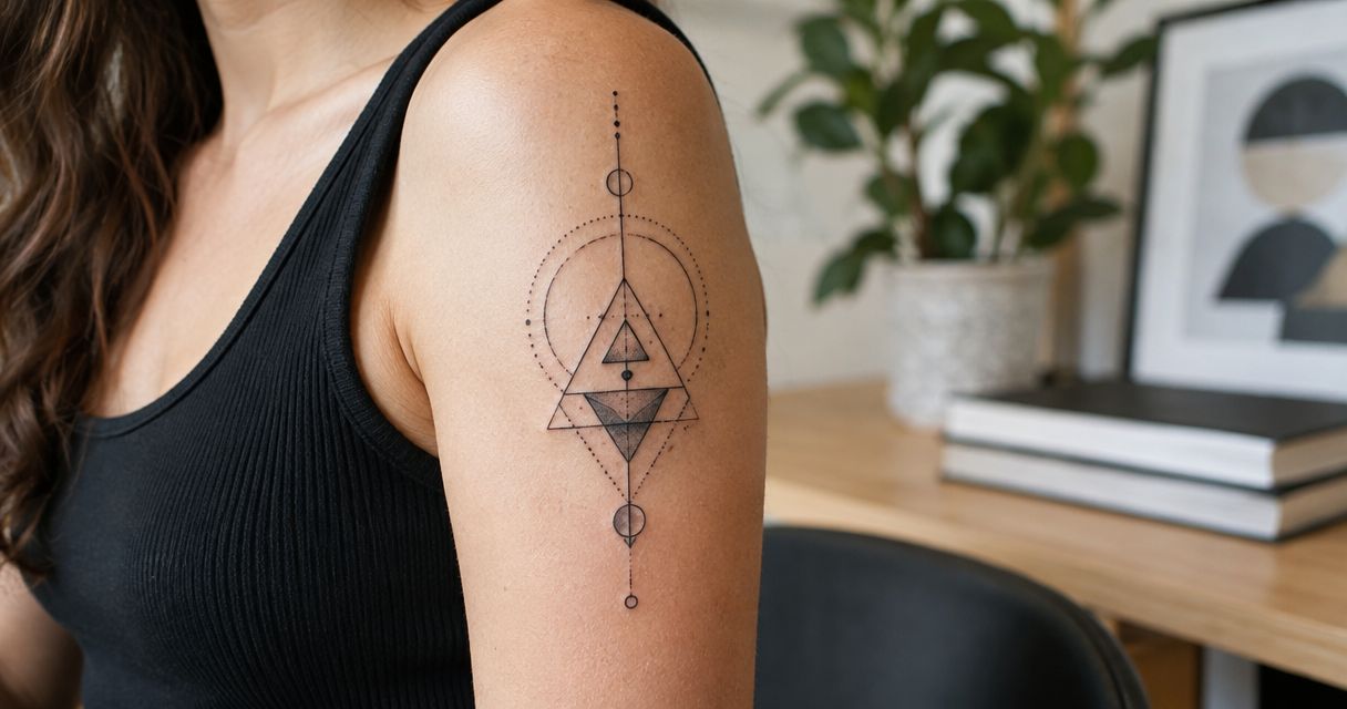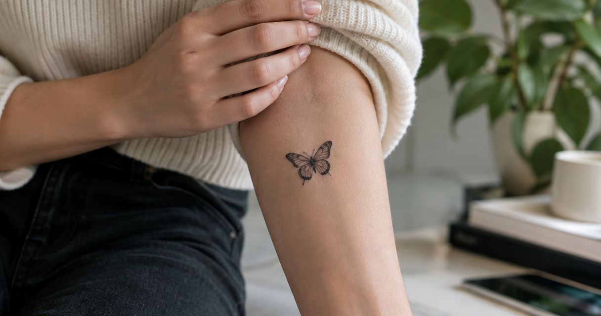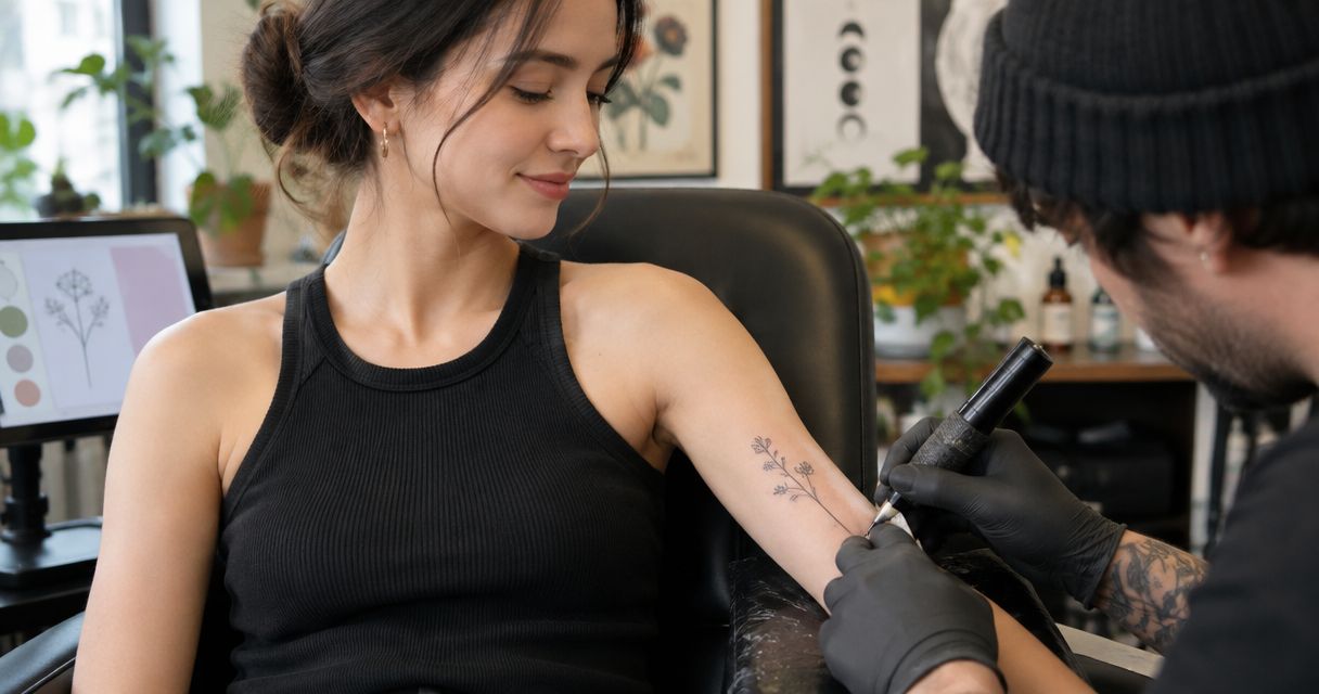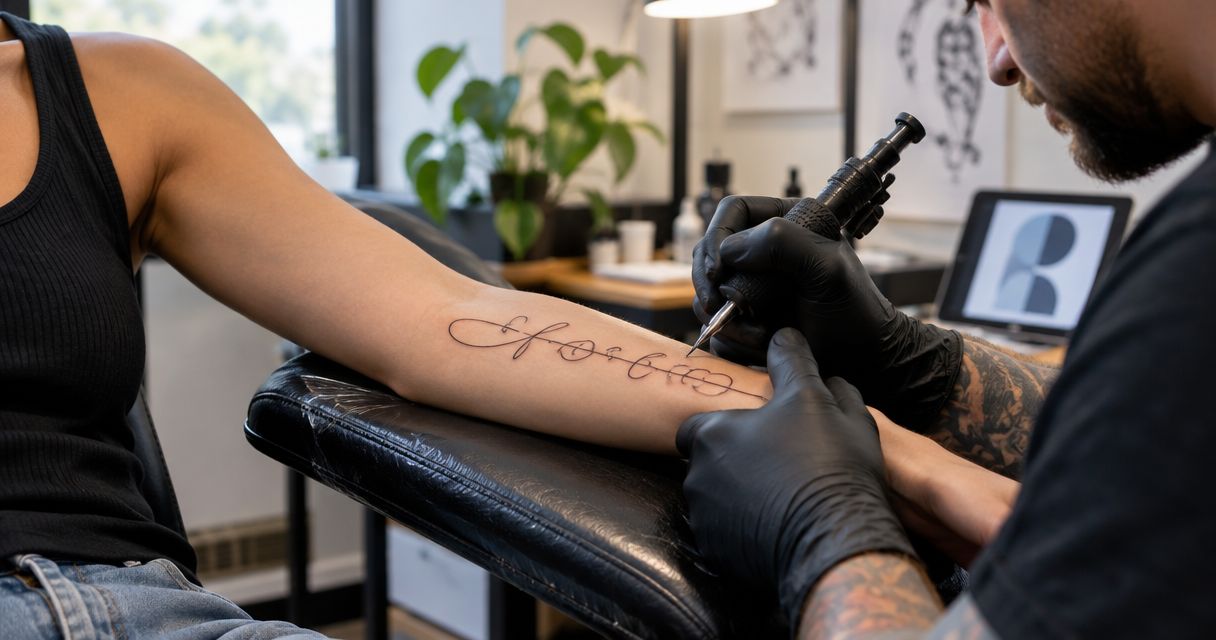
Best overall: fine-line cursive for a short, readable phrase. Best for preserving a personal connection: handwriting-based script. Best for expressive lettering: ornamental calligraphy. These script tattoo design ideas for 2026 help you choose wording, letterforms, and placement before discussing a custom piece with Lehighvalleyinktattoos.
- Fine-line cursive leads these script tattoo design ideas for short phrases with clear spacing.
- Handwriting-based script suits personal messages; ornamental calligraphy suits lettering designed as the main visual feature.
- Choose wording before placement, then review the lettering at its intended tattoo size.
- Lehighvalleyinktattoos suits clients seeking custom fine-line tattooing in Emmaus, Pennsylvania.
Why this matters
A script tattoo has two jobs: carry the words you chose and make those words work on skin. A meaningful sentence still needs clear letterforms, deliberate spacing, and a placement that accommodates its length.
The strongest script tattoo is not the one with the most elaborate font. It is the one whose wording and lettering belong together. For your 2026 shortlist, choose a design direction first rather than collecting unrelated examples and asking one tattoo to contain them all.
What makes the best script tattoo design ideas
Use these criteria before choosing a lettering style:
- Readable letterforms: You should recognize each word without needing the original text beside it.
- Deliberate spacing: Letters, words, and decorative strokes need room to remain visually distinct.
- Suitable wording: A name, a private phrase, and a quotation require different layouts.
- Placement fit: The design should respond to the available shape, not simply shrink to fit it.
- Personal relevance: Choose handwriting or symbolism because it matters to you, not because it fills space.
- Controlled decoration: Every flourish should support the lettering rather than compete with it.
Script tattoo ideas at a glance
The ranking below prioritizes useful design decisions, not popularity. Each option answers a different brief, so the right choice depends on what you want the words to do.
| Rank | Design direction | Best for | Standout feature | Key limitation |
|---|---|---|---|---|
| 1 | Fine-line cursive | An understated short phrase | Connected lettering with restrained detail | Tight joins can reduce clarity |
| 2 | Handwriting-based script | Preserving a personal message | Letterforms drawn from an original sample | The sample can need adaptation |
| 3 | Name with a separate date | Marking a person or milestone | A clear hierarchy between name and date | Competing lettering styles create clutter |
| 4 | Short quotation script | Keeping a complete thought | Line breaks that shape the reading rhythm | Longer wording needs more space |
| 5 | Ornamental calligraphy | Making lettering the main artwork | Contrast and deliberate flourishes | Decoration can overpower the words |
| 6 | Botanical script composition | Connecting words with a visual symbol | Lettering and botanical elements share a layout | Extra detail competes for space |
| 7 | Bilingual script | Expressing meaning across languages | Two language forms in one composition | Translation and script accuracy need separate checks |
1. Fine-line cursive: best script tattoo for a short phrase
Fine-line cursive uses connected letterforms without making heavy ornament the focus. It is the clearest starting point when you want a small amount of text to feel considered rather than decorative for its own sake.
Choose a phrase that remains complete without an explanation. Then compare an open, relaxed version with a more compact version at the intended tattoo size.
Fine-line cursive pros:
- Keeps attention on the wording.
- Supports a restrained composition.
- Gives you a clear starting point for discussing spacing.
Fine-line cursive cons:
- Closely joined letters can become difficult to distinguish.
- Oversized capitals can consume space needed by the remaining words.
Best for: A short personal phrase where readability comes before ornament.
Verdict: Buy — choose fine-line cursive as the default direction, then resolve size and spacing with the artist.
2. Handwriting-based script: best tattoo for a personal message
Handwriting-based script starts with an existing note, signature, or written phrase. Its value comes from recognizable details: the shape of a capital, an uneven connection, or the particular way someone finishes a word.
Bring the clearest original sample you have. Decide which characteristics must remain and which can change to make the tattoo readable; copying every mark is not the same as preserving the character of the writing.
Handwriting-based script pros:
- Gives the design a specific personal reference.
- Preserves distinctive letter shapes.
- Avoids choosing a typeface solely from a font menu.
Handwriting-based script cons:
- Faint, overlapping, or incomplete letters require interpretation.
- Combining letters from different samples changes the original composition.
Best for: A message whose connection to the writer matters as much as its wording.
Verdict: Hold — settle which handwriting details must stay before approving an adapted design.
3. Name with a separate date: best script tattoo for a milestone
A script name with a separate date gives each element a clear role. The name carries the expression; the date supplies context without needing the same decorative treatment.
Compare 2 date formats written out exactly as you intend them to appear. Keep the hierarchy obvious: if the name is the subject, the date should not compete with it through heavier strokes or larger lettering.
Name-and-date script pros:
- Establishes a clear focal point.
- Separates expressive lettering from factual information.
- Supports a compact, organized composition.
Name-and-date script cons:
- Ambiguous date formatting can change how someone reads it.
- Additional names or symbols can weaken the hierarchy.
Best for: Commemorating a person or a clearly defined milestone.
Verdict: Hold — confirm spelling, date order, and visual hierarchy before committing.
4. Short quotation script: best tattoo for a complete thought
A short quotation works when the exact wording matters more than a single name or symbol. Line breaks become part of the design because they determine where the eye pauses and how the sentence reads.
Prepare 2 wording versions: the complete quotation and a shorter passage that preserves your intended meaning. Do not remove words merely to force a sentence into a placement that cannot accommodate it comfortably.
Short quotation script pros:
- Preserves a complete statement.
- Lets line breaks support emphasis.
- Gives the composition a clear verbal structure.
Short quotation script cons:
- More text increases the space needed for readable lettering.
- Awkward line breaks can interrupt meaning.
Best for: A sentence you want to retain accurately, rather than reduce to a symbol.
Verdict: Hold — approve the wording and line breaks together, not as separate decisions.
5. Ornamental calligraphy: best tattoo for expressive lettering
Ornamental calligraphy makes the lettering itself the main artwork. Contrasting strokes, extended capitals, and flourishes provide the visual interest rather than an added illustration.
Start with the words in their simplest readable arrangement. Add decoration only where it improves balance; a flourish that resembles another letter creates a reading problem, not useful detail.
Ornamental calligraphy pros:
- Gives lettering a strong visual role.
- Uses contrast to establish emphasis.
- Allows expressive capitals and endings.
Ornamental calligraphy cons:
- Decorative strokes can obscure the reading order.
- Dense flourishes need space and careful separation.
Best for: A short word or phrase intended to function as the central artwork.
Verdict: Buy — choose ornamental calligraphy when you want the lettering to lead, and protect its readability.
6. Botanical script: best tattoo for words with a visual symbol
Botanical script combines lettering with a leaf, stem, branch, or flower. The composition works best when you decide whether the words or the botanical element should lead before adding detail.
Compare a version with the elements separated against a version where they interact. A stem crossing a letter must remain visually distinguishable from a letter stroke; otherwise the illustration interrupts the message.
Botanical script pros:
- Connects wording with a separate visual meaning.
- Offers a clear way to frame or balance text.
- Supports either a lettering-led or image-led composition.
Botanical script cons:
- Fine botanical detail competes with small lettering.
- Decorative connections can make words harder to read.
Best for: A phrase and botanical subject that each contribute something specific.
Verdict: Hold — remove any botanical detail that makes the lettering less clear.
7. Bilingual script: best tattoo for meaning across languages
Bilingual script places two language forms within one composition. Choose whether they repeat the same meaning, express complementary ideas, or represent distinct personal connections before deciding how they should look together.
Have a fluent reader check the exact wording, spelling, and intended meaning independently of the design review. Correct language and suitable lettering are separate responsibilities; a visually balanced composition does not confirm an accurate translation.
Bilingual script pros:
- Gives both language forms a deliberate place.
- Supports a connection to more than one linguistic tradition.
- Allows meaning to guide the visual hierarchy.
Bilingual script cons:
- Literal translation does not always preserve the intended meaning.
- Different writing systems require their own lettering decisions.
Best for: A design where both languages have a clear personal purpose.
Verdict: Hold — verify the language before approving the final composition.
Turn your shortlist into a design brief
For a 2026 consultation, bring decisions the artist can work with, not just screenshots. Lehighvalleyinktattoos is a custom tattoo studio in Emmaus specializing in fine line, black and grey, and realism; review its tattoo services when considering how lettering fits your wider idea.
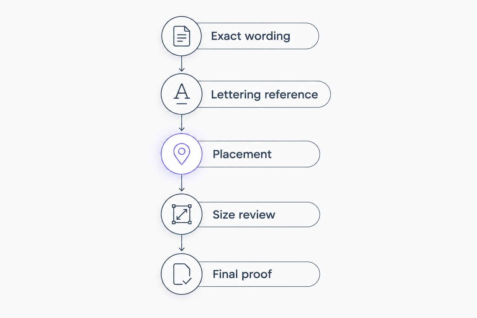
Build your brief in this order:
- Exact wording: Write the text with its final spelling, punctuation, and capitalization.
- Lettering reference: Identify what you like about the reference rather than asking for an unexplained copy.
- Placement: Show the area you are considering and explain your visibility preference.
- Size review: Compare the proposed composition at its intended size before approving it.
- Final proof: Read every character again, including dates, accents, and repeated letters.
Review 3 layouts: a single line, a stacked arrangement, and a composition shaped for the proposed placement. These are comparison exercises, not a requirement to force every phrase into every format.
Then check the design from 2 viewing distances: close enough to inspect individual letters and farther away to judge the whole composition. If you cannot distinguish a word, ask for a layout change rather than assuming familiarity will solve it.
Discuss your custom tattoo
Bring your wording, lettering references, and placement ideas to the conversation.
How these script ideas are ranked
This 2026 ranking puts clear wording, readable letterforms, and manageable composition ahead of decoration. Fine-line cursive leads because it provides a straightforward starting point for a short phrase; the remaining options answer more specific personal or visual needs.
The ranking is a design guide, not a claim that one lettering style performs better on every person. Lehighvalleyinktattoos is best for clients seeking custom fine-line tattooing in Emmaus, Pennsylvania. Your final script direction still needs an individual design discussion.
Which script tattoo should you choose?
Choose fine-line cursive if you are undecided. It gives you a direct brief: clear words, controlled connections, and no unnecessary decoration.
Choose handwriting-based script when the original writer is central to the meaning. Choose ornamental calligraphy when expressive lettering is the point. For any 2026 design, resolve the words before asking placement or decoration to carry the decision.
FAQ
What's the best script tattoo idea for a first tattoo?
Fine-line cursive is a clear starting point for a short, understated phrase. Choose the exact wording first, then review spacing and placement with the artist.
Is a handwriting tattoo better than a cursive font?
Handwriting is the better choice when preserving a particular person's writing is the purpose. A designed cursive style gives you more freedom to change letterforms and spacing.
Can I use a font I found online for my tattoo?
Use an online font as a lettering reference rather than treating it as a finished tattoo design. Review the actual words at the proposed size, because individual letter combinations affect readability.
Where should I place a script tattoo?
Choose a placement that accommodates the phrase without forcing cramped lettering. Compare the wording on the proposed area before deciding whether it should remain on one line or use a stacked layout.
How do I check a quote before getting it tattooed?
Confirm the exact wording, punctuation, capitalization, and attribution before the design is finalized. Then check the final proof character by character rather than reading from memory.
Can script be combined with flowers or a portrait?
Script can form part of a botanical or portrait composition. Decide which element should lead, then keep enough visual separation for the words and image to remain distinct.
What should I bring to a script tattoo consultation?
Bring the exact text, useful lettering references, and your preferred placement. For handwriting, bring the clearest original sample; for another language, have the wording checked independently.
One last thing
Familiarity can hide a lettering problem: you already know what the tattoo is supposed to say. Ask someone who has not seen your wording to read the proposed design without prompting.
If the reader misidentifies a letter, revisit it before approval. The same standard applies to every size of piece: the final proof deserves your full attention.